Visual communication for policy and program management
Client: Lyndon B. Johnson School of Public Affairs at the University of Texas at Austin | Role: Teaching and presentation design | Year: 2021
Abstract
Invited lecture for Ben Guhin Delphine’s course on Public Management in the LBJ School of Public Affairs at the University of Texas at Austin.
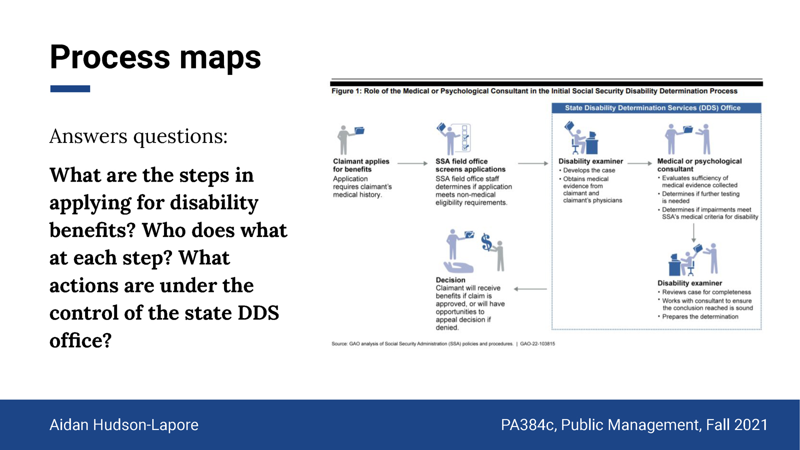
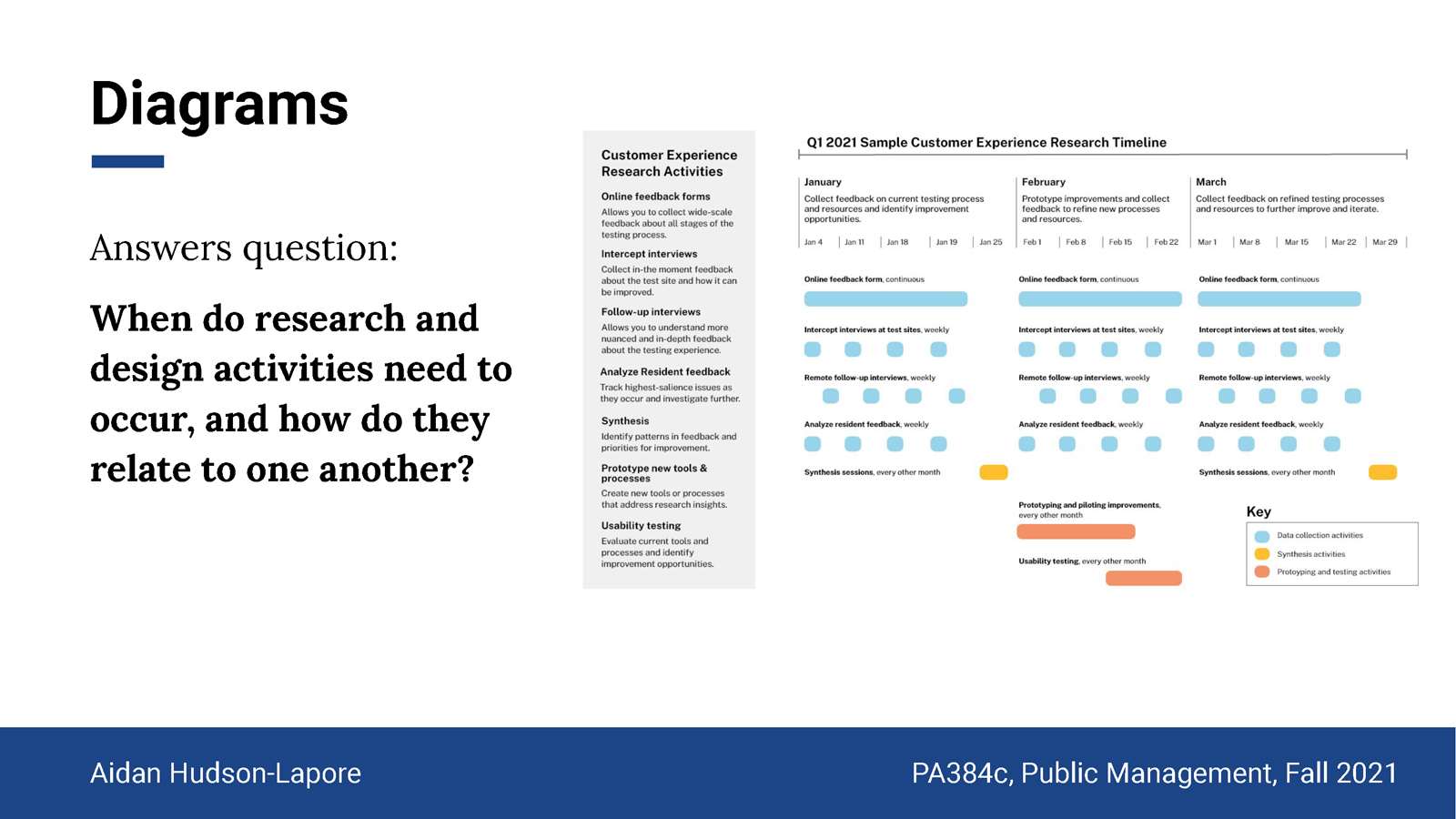
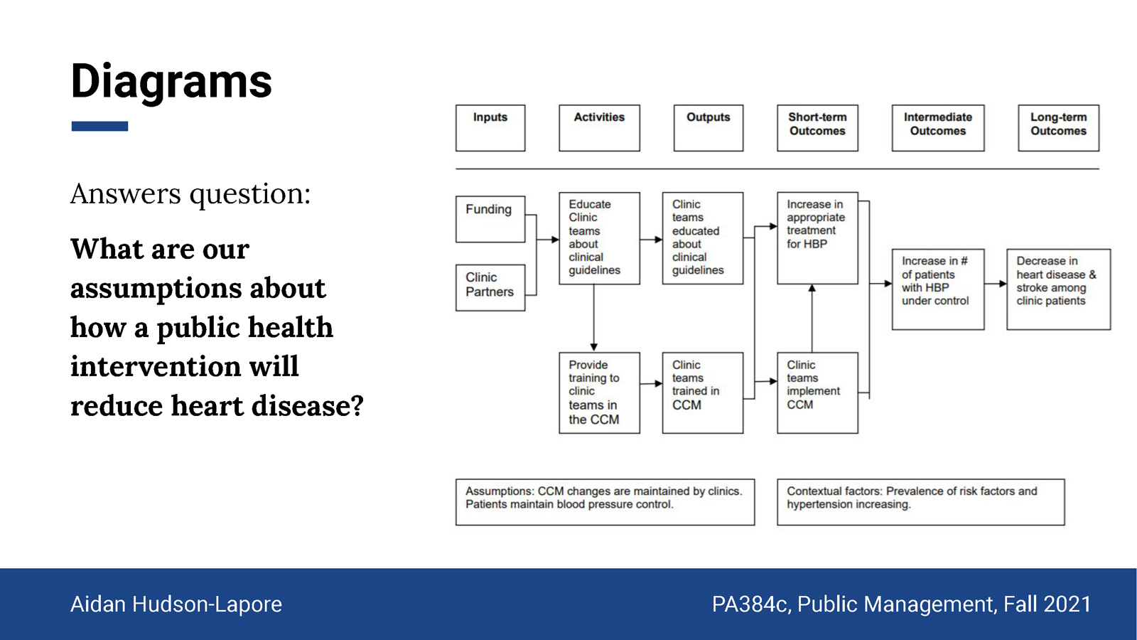
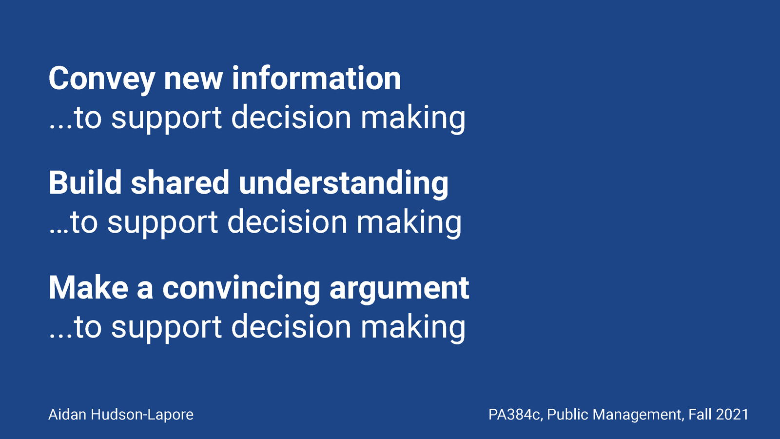
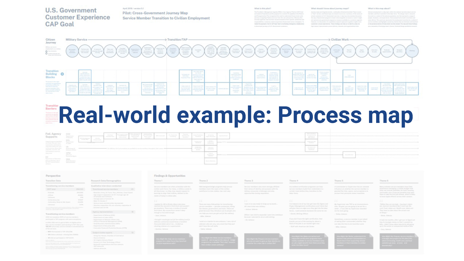
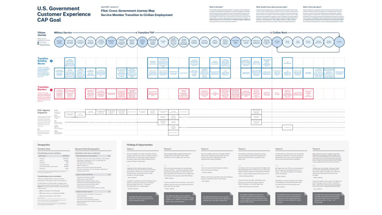
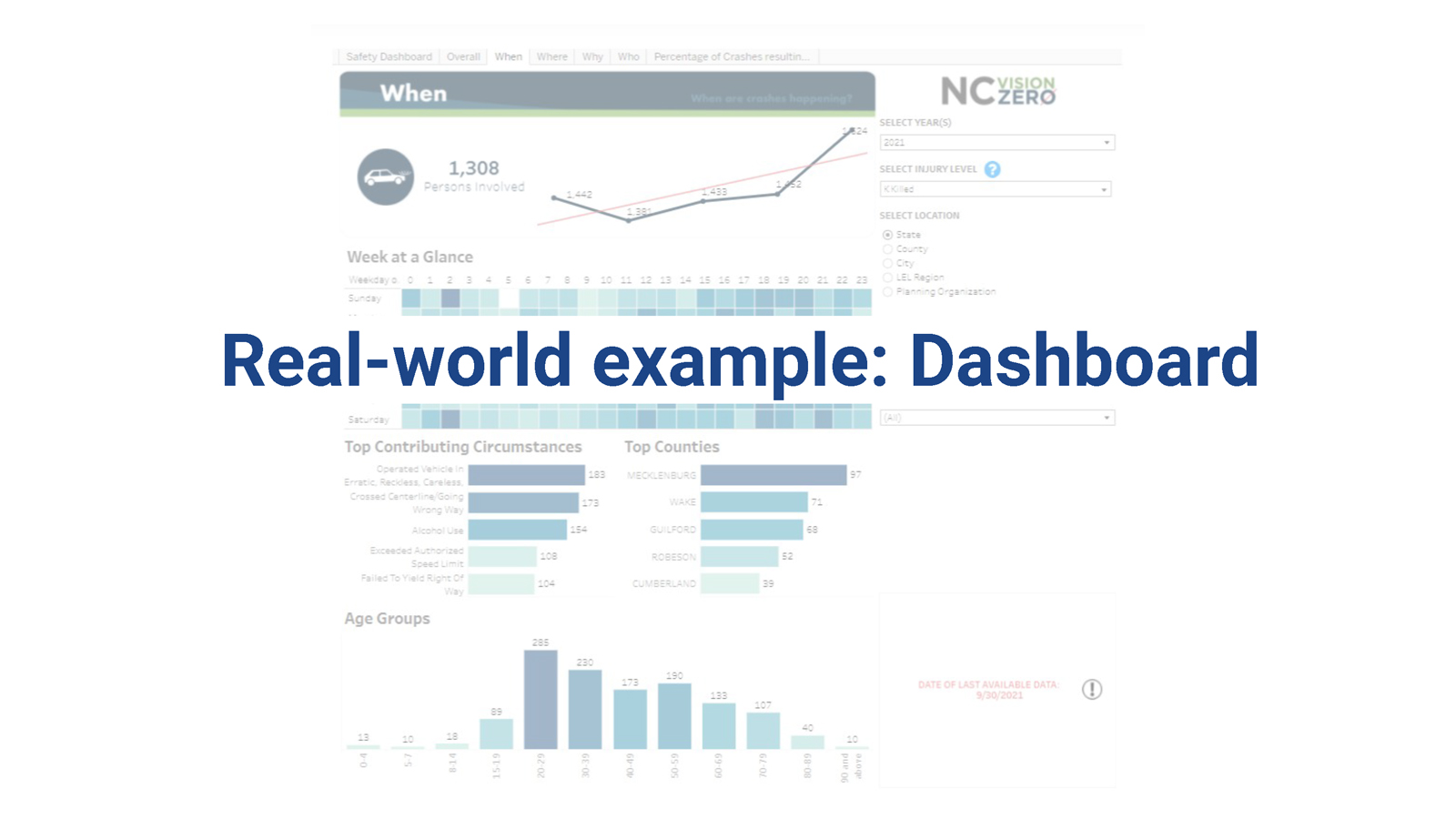
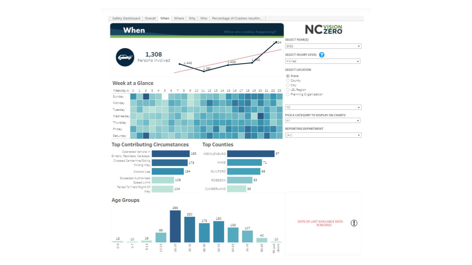
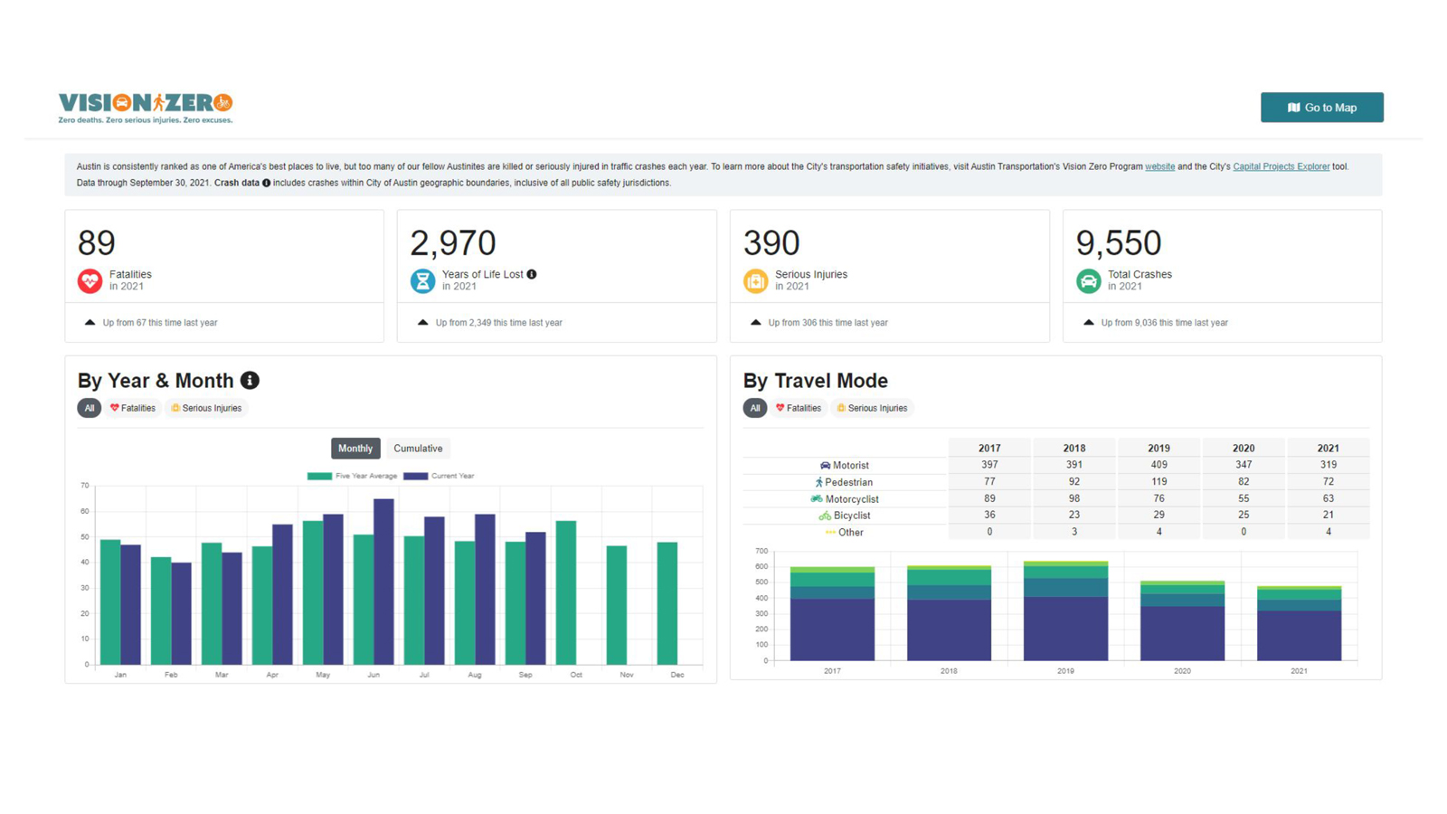
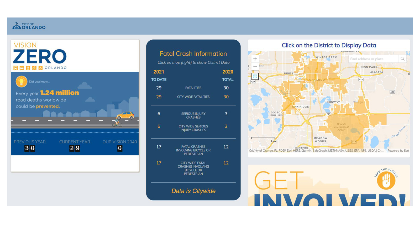
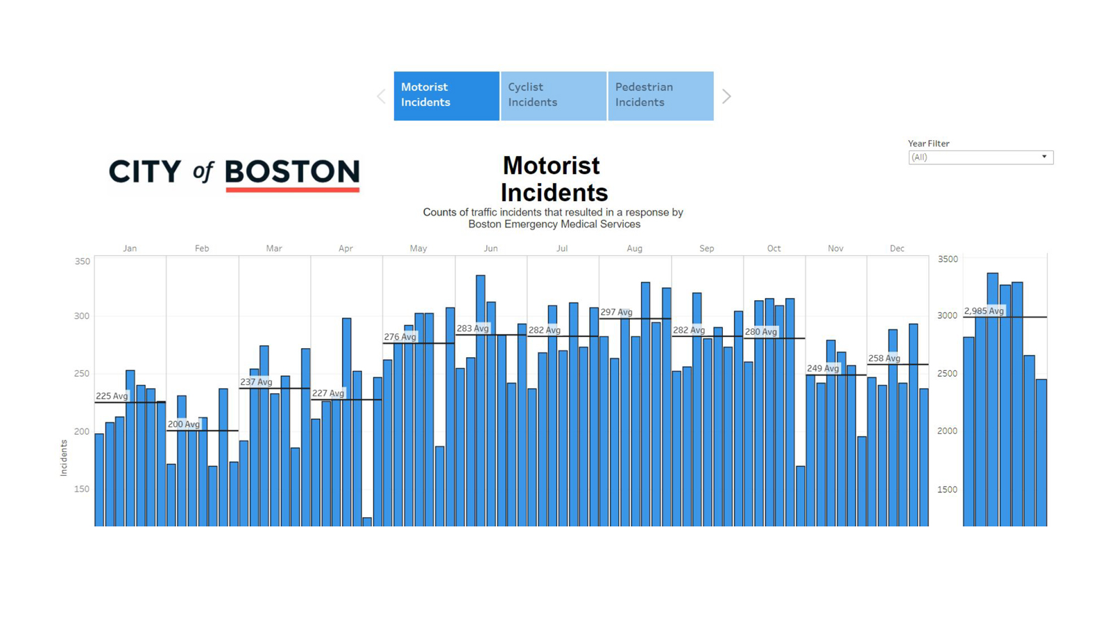
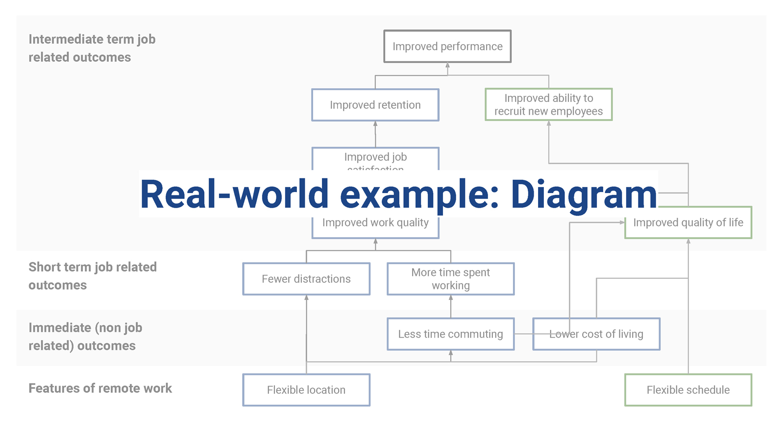
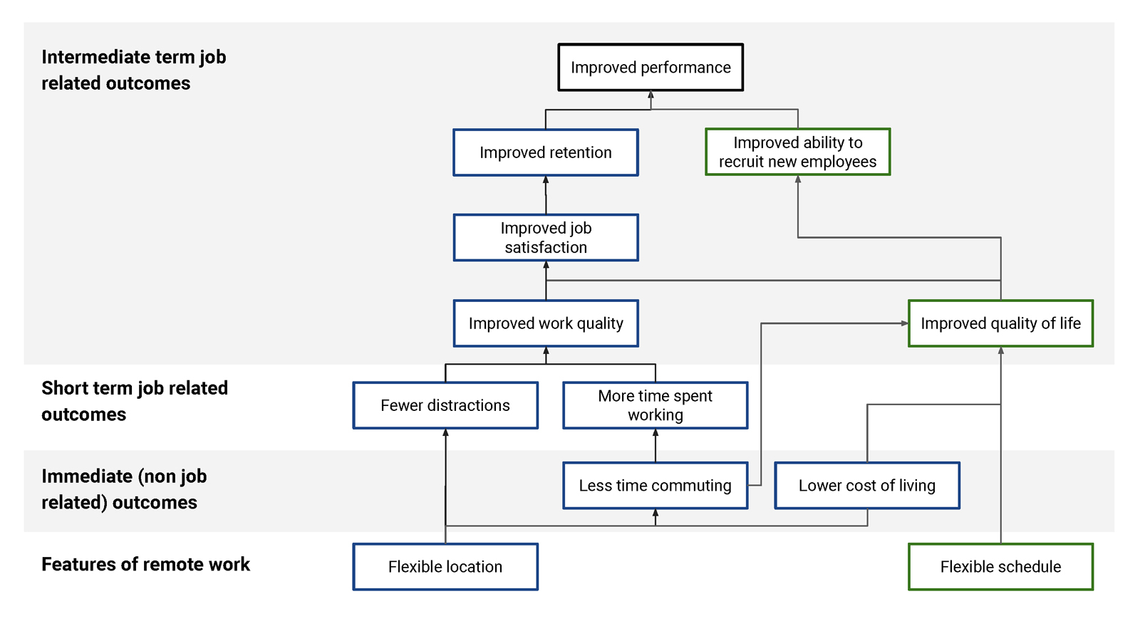
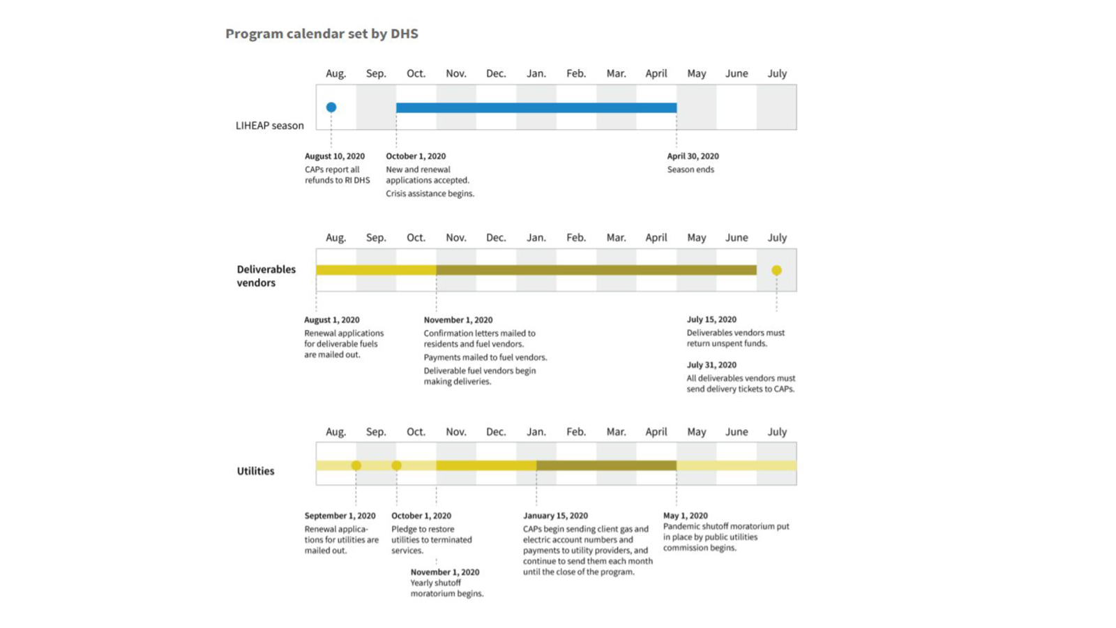
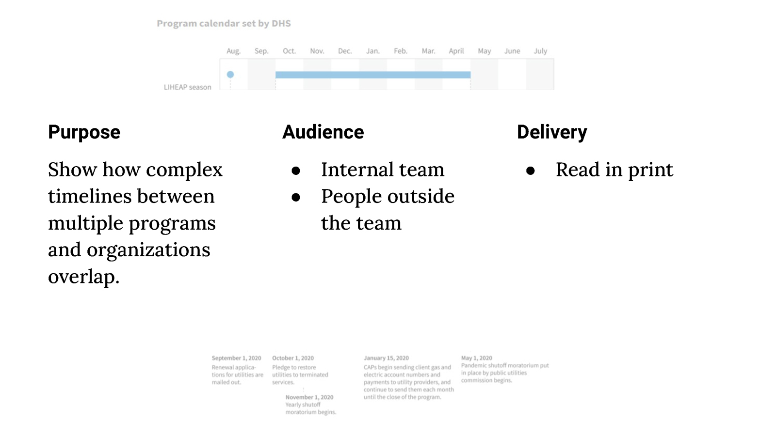
In public policy, visual communication is often associated solely with displaying quantitative data. This presentation expands this definition of visual communication to include effective tools for displaying descriptive information, such as process maps and diagrams, with a focus on how visualizations of both quantitative and qualitative information can best support decision-making.
_Page_20")
Presentation details
Slide excerpts
_Page_19")
_Page_18")
_Page_25")
_Page_11")
_Page_23")
_Page_15")
Presentation description
Introduces foundations of mapping, diagramming, and data visualization for policy and program management.
Learning objectives:
- Understand common visuals in government and when they are most useful
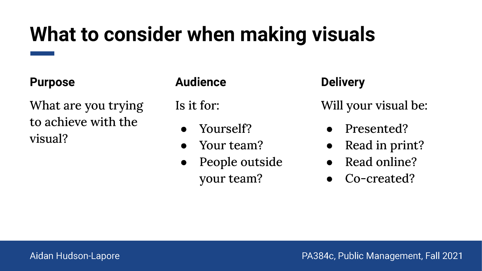
- Consider intended purpose, audience, and delivery format when making or commissioning visuals
- Identify intended outcomes of a given visualization
Click the image below to view the full presentation (47 slides).